Background
Our objective was to create innovative and appealing packaging for our new line of food containers under the brand "East in West." The packaging needed to reflect the brand's commitment to quality, safety, and convenience, ensuring it stood out on the shelves and appealed to both individual consumers and food businesses.
Brand Identity
"East in West" embodied a fusion of traditional Eastern culinary excellence with modern Western convenience. The brand was dedicated to providing premium, reliable, and safe food storage solutions that catered to the diverse needs of our customers.
Target Audience
Our primary audience included busy professionals, families, health-conscious individuals, and food service businesses such as restaurants and caterers. These consumers valued durability, ease of use, and safety in their food storage solutions.
Design Objectives
The packaging design was intended to be visually striking and convey a sense of premium quality and reliability. It needed to prominently display key features such as BPA-free materials, heavy-duty construction, snap-on lids, microwave safety, freezer safety, and leak resistance. The design included clear, high-resolution images of the containers in use, filled with various types of food to illustrate versatility. The brand logo, "East in West," was clearly visible and associated with a modern yet sophisticated aesthetic.
Functional Requirements
The packaging was designed to be easy to open and reseal, allowing consumers to inspect the product without damaging the package. Information about the product, including usage instructions, volume, and quantity, was clearly printed on the packaging. Additionally, certifications such as BPA-free and microwave safe were prominently displayed.
Marketing Strategy
Our marketing strategy highlighted the unique selling points of the food containers through various channels, including in-store displays, online advertising, and social media campaigns. The packaging design itself played a crucial role in this strategy by serving as a key touchpoint for consumers. We created visually appealing point-of-sale displays that showcased the product's features and benefits, leveraging the design to attract attention and drive sales. Online marketing included high-quality images and videos demonstrating the product's versatility and convenience.
Conclusion
The new packaging for "East in West" food containers reflected our brand's dedication to quality, safety, and convenience. It was visually appealing, functional, and effectively communicated the product's benefits to our target audience, supporting our broader marketing efforts. The goal was to create a packaging design that not only protected and preserved the product but also enhanced the overall customer experience and drove brand loyalty.
The image displays three logo concepts for the brand "East in West," each highlighting the fusion of Eastern and Western cultures. Concept 1 features a clean, bold design within an oval shape, with "EAST IN WEST" in uppercase letters; "EAST" is in red, "WEST" in blue, and "IN" is red with a downward arrow, emphasizing a straightforward and readable style. Concept 2 is more intricate, showcasing two dragons flanking a UK map overlaid with the British flag, set against an outline of an Asian pagoda. It includes the brand name in a casual script and Chinese characters "思源体" above, symbolizing the blend of cultures through detailed imagery. Concept 3, similar to Concept 2, is contained within a circular shape and features the same dragons, UK map, and pagoda, with the phrase "East in West" in a playful, curved script and Chinese characters "东在西" at the top, creating a dynamic and symmetric design that vividly represents the cultural integration.
I decided to go with Concept 3 because it effectively encapsulates the brand’s mission of blending Eastern and Western cultures in a visually appealing and balanced design. The circular shape with a double-lined border gives the logo a cohesive and complete look, making it versatile for various applications. The use of two dragons, symbolising strength and cultural heritage, flanking the UK map overlaid with the British flag, clearly represents the East and West elements. The background outline of the Asian pagoda further emphasises the cultural fusion. The phrase "East in West" in a playful, curved script adds a modern and approachable feel, while the Chinese characters "东在西" at the top reinforce the theme in a multilingual context. This combination of traditional symbols with contemporary design elements makes Concept 3 stand out as a dynamic and engaging logo that accurately reflects the brand’s identity and message.
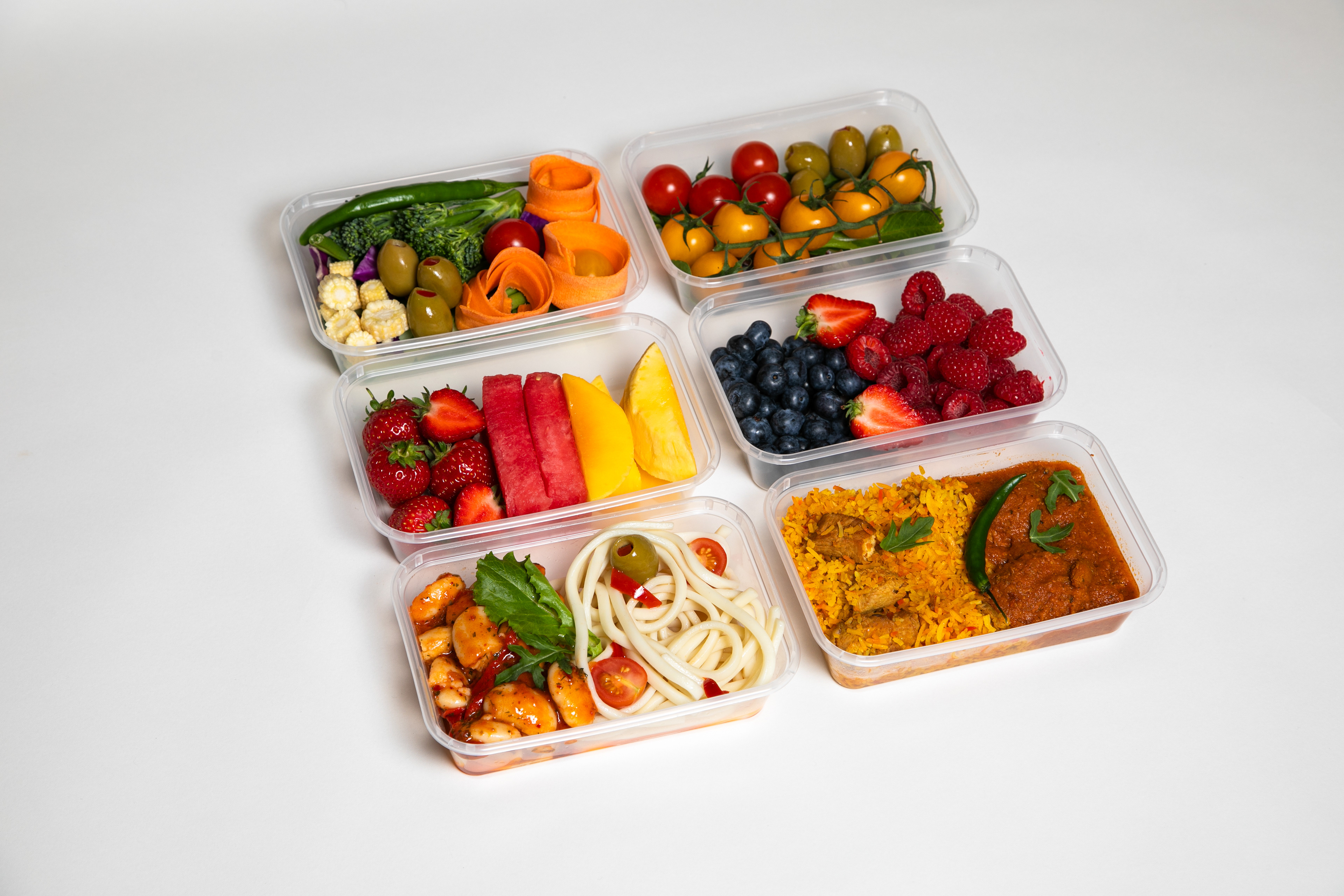
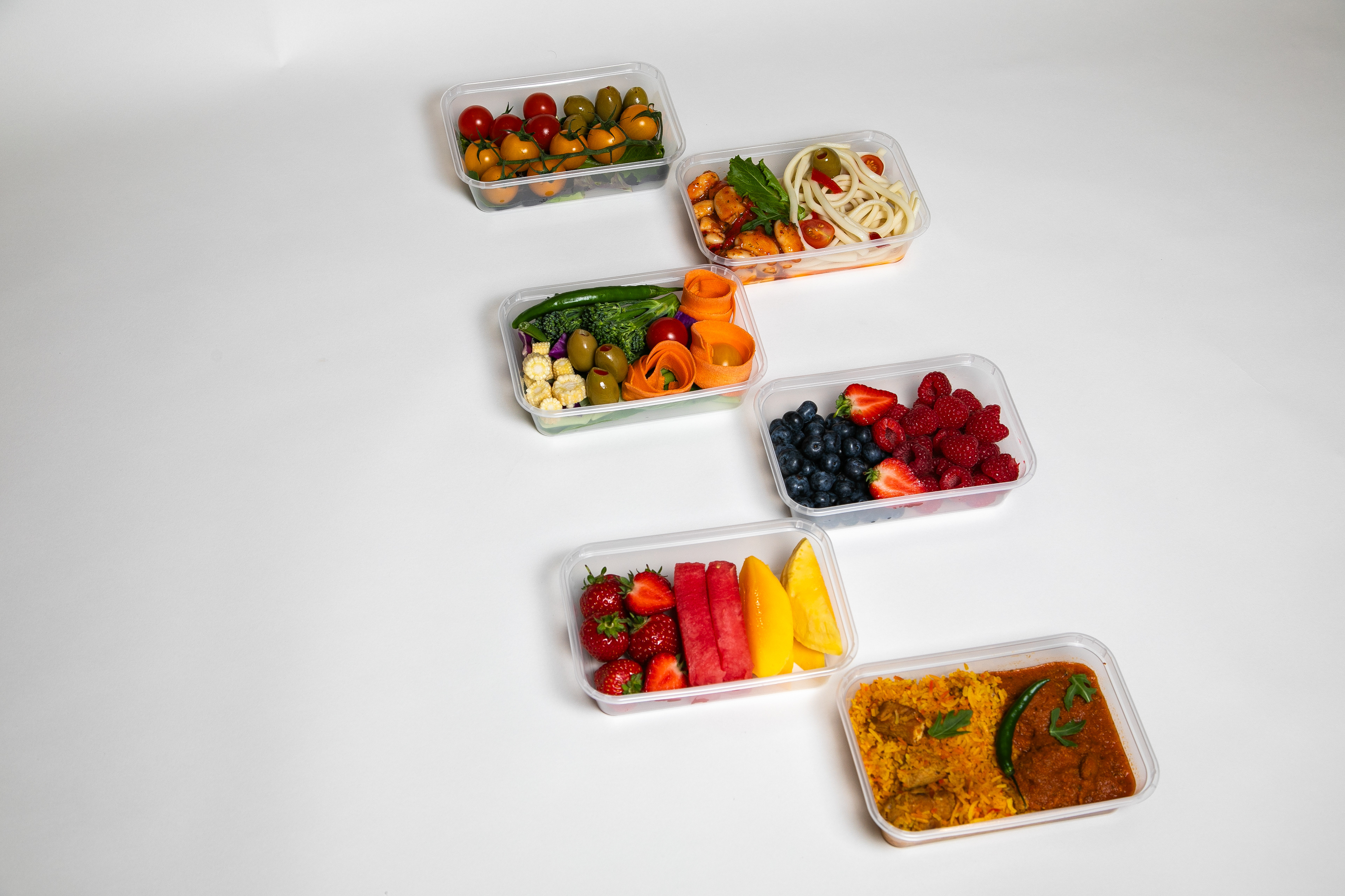
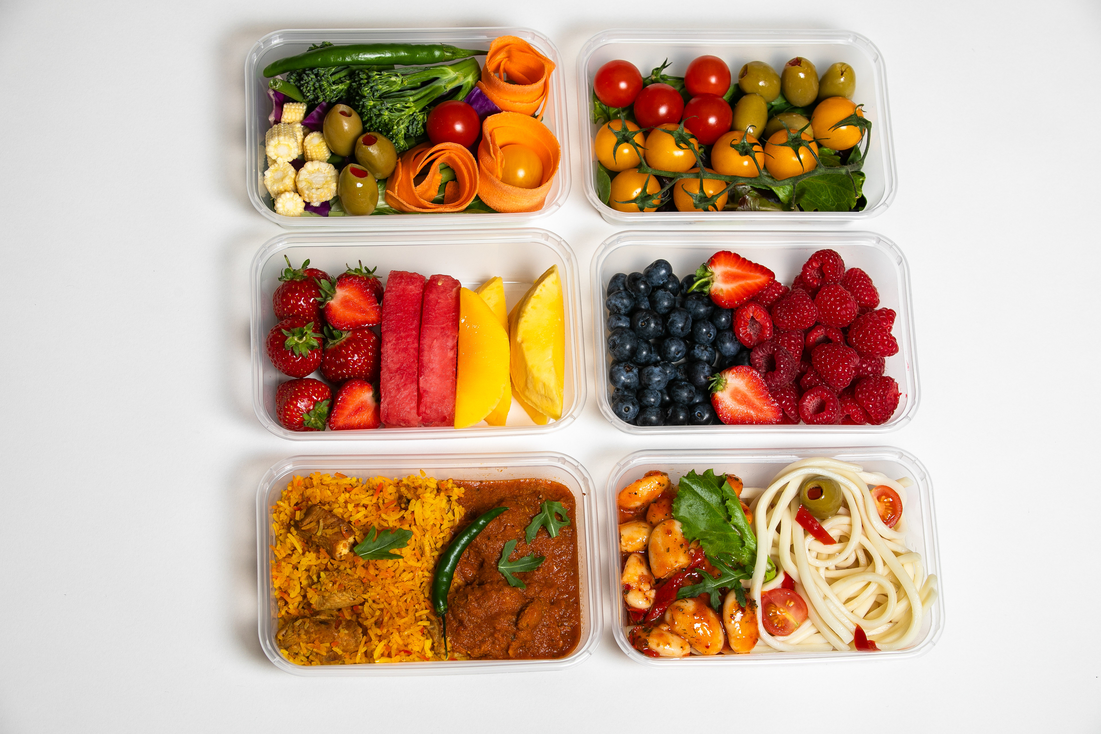
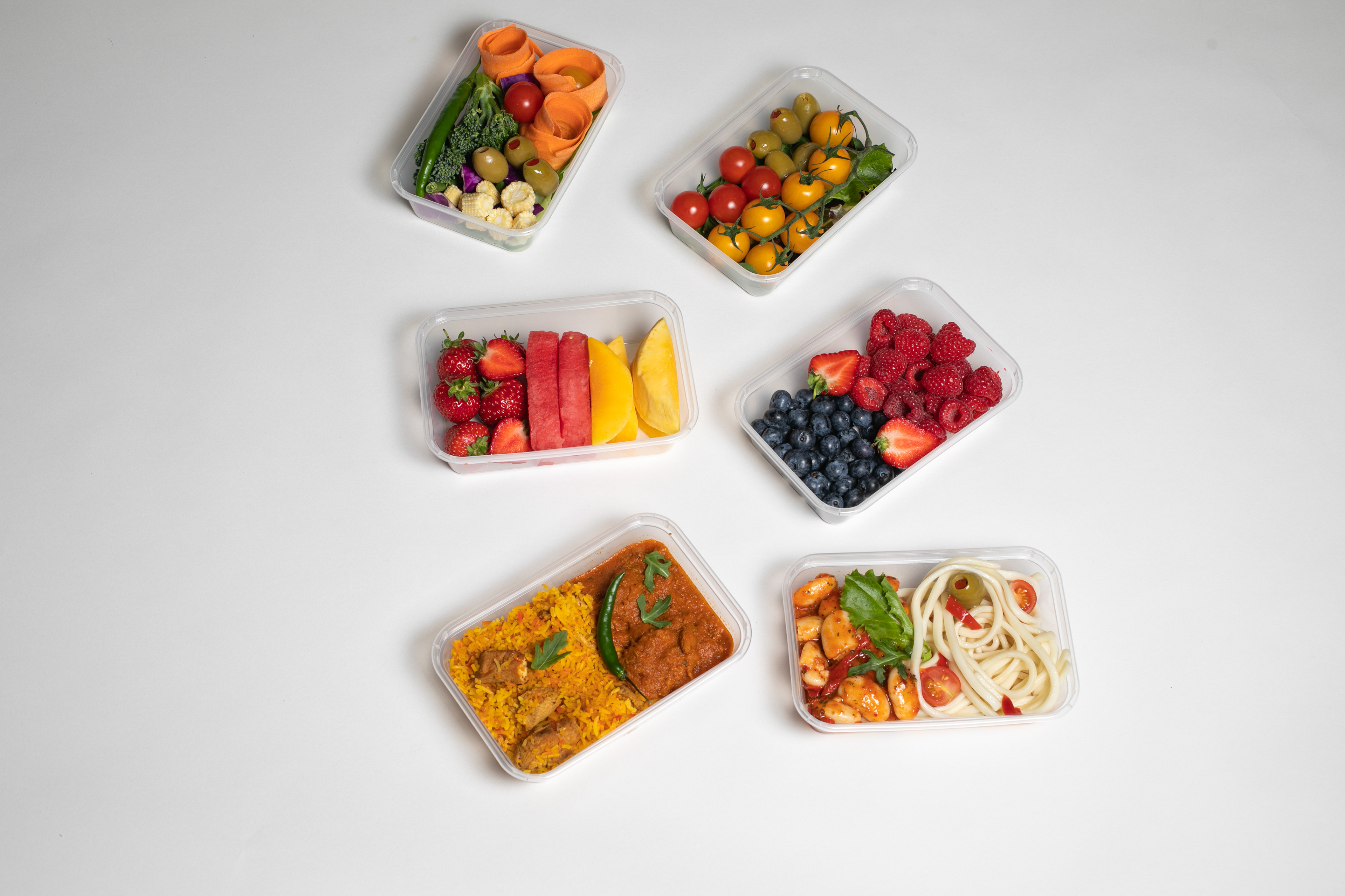

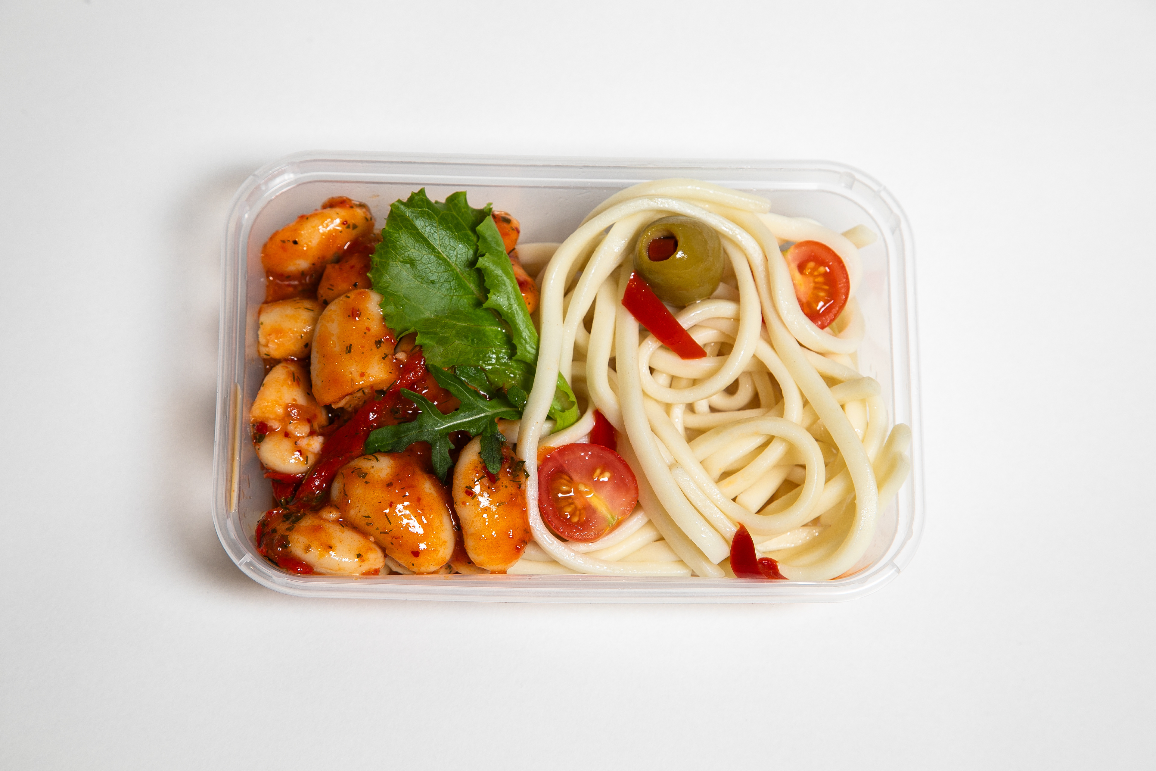
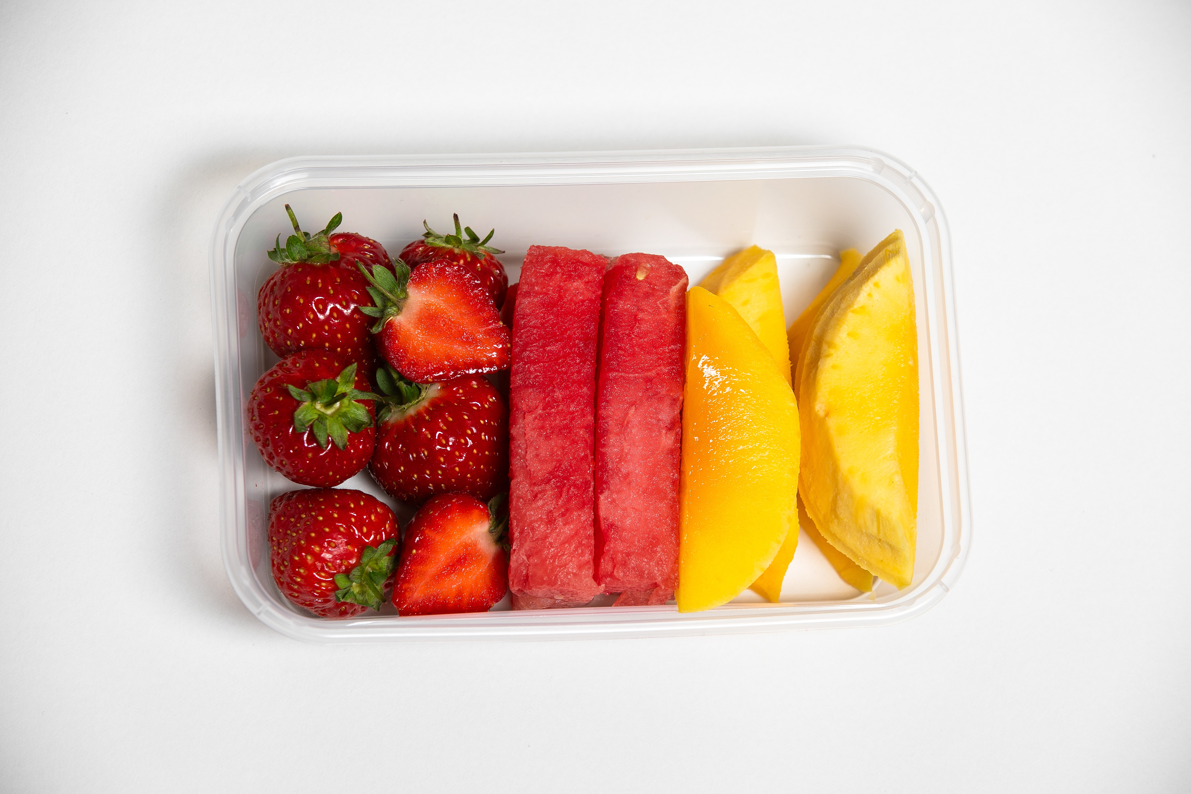


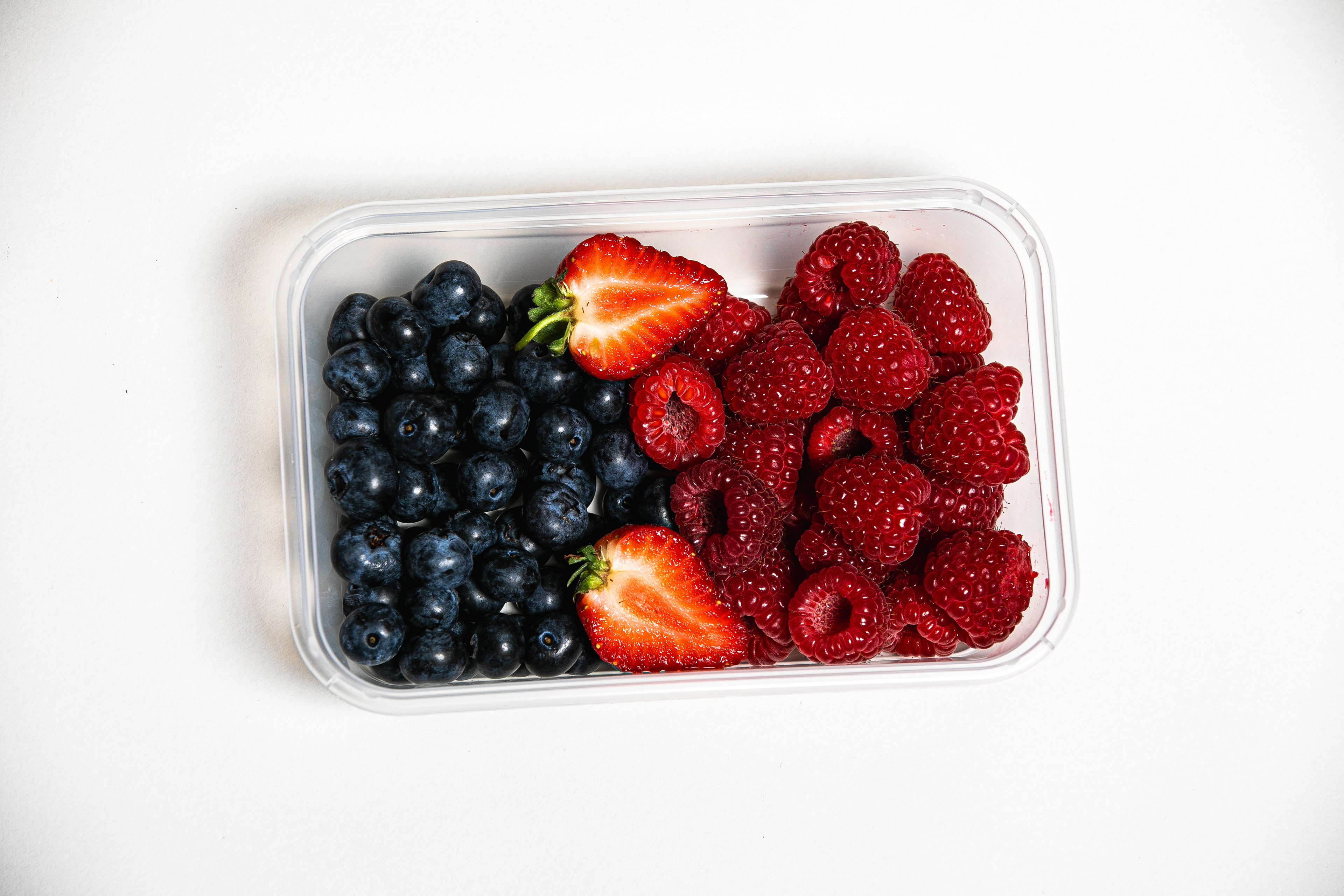
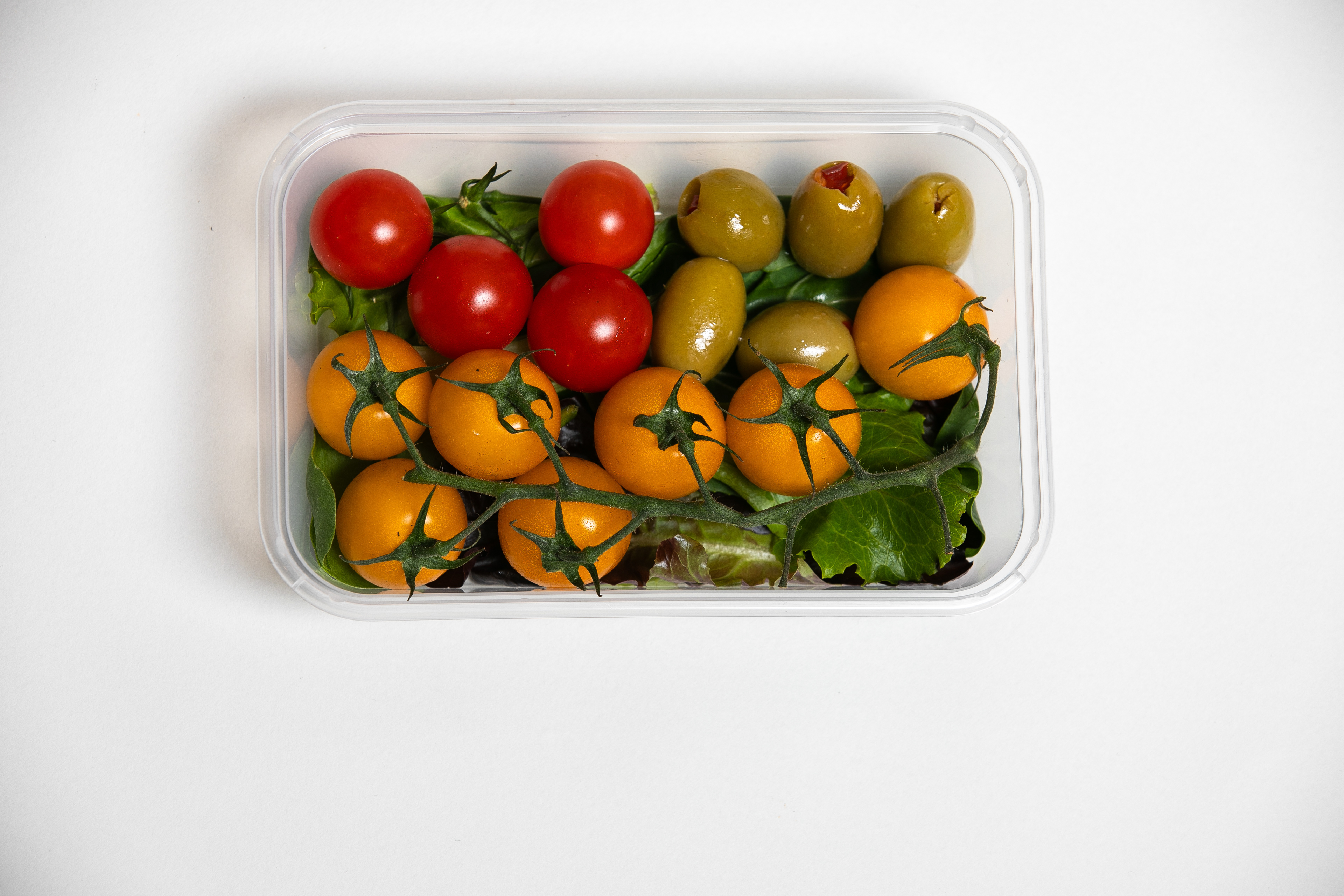
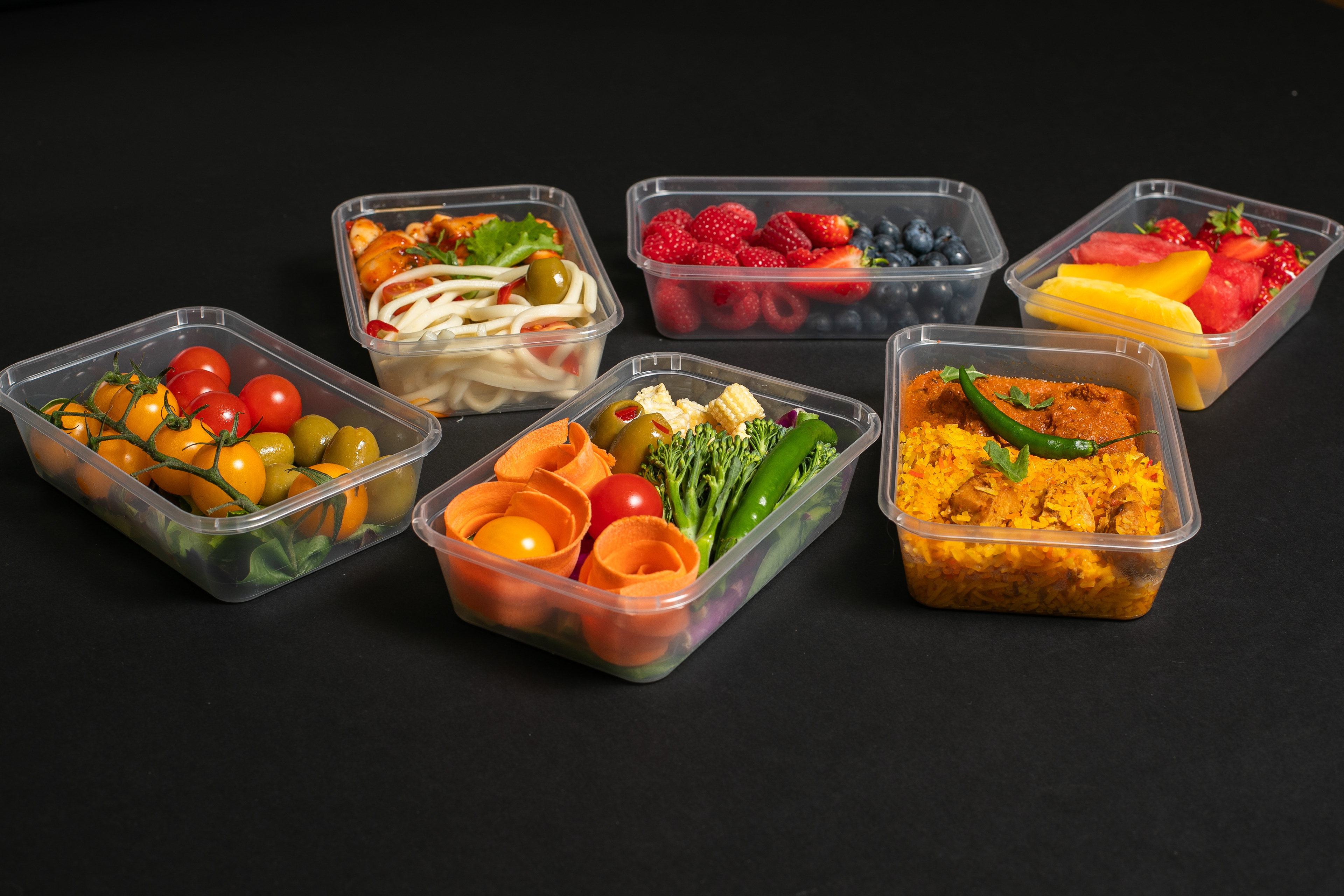

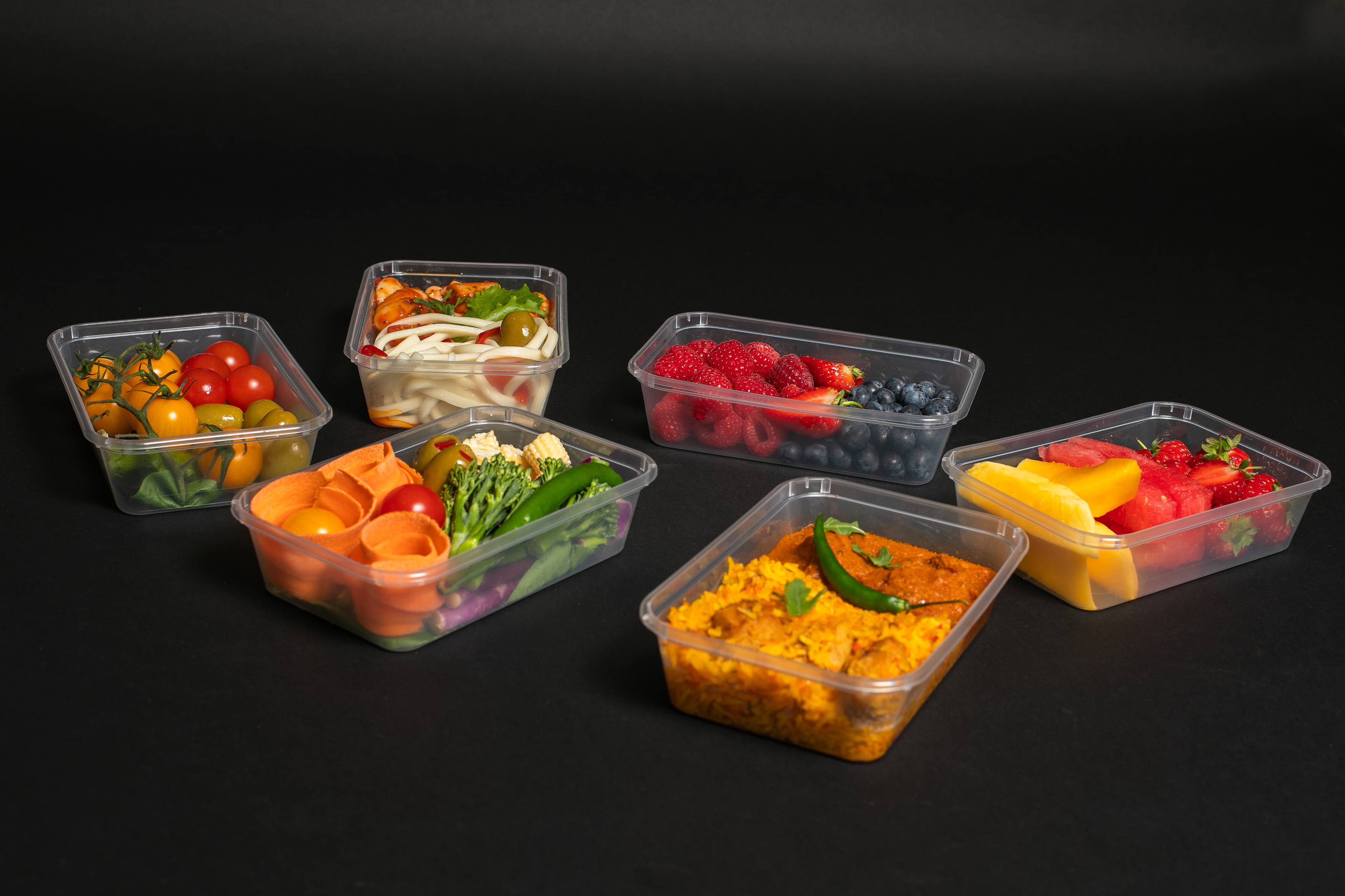


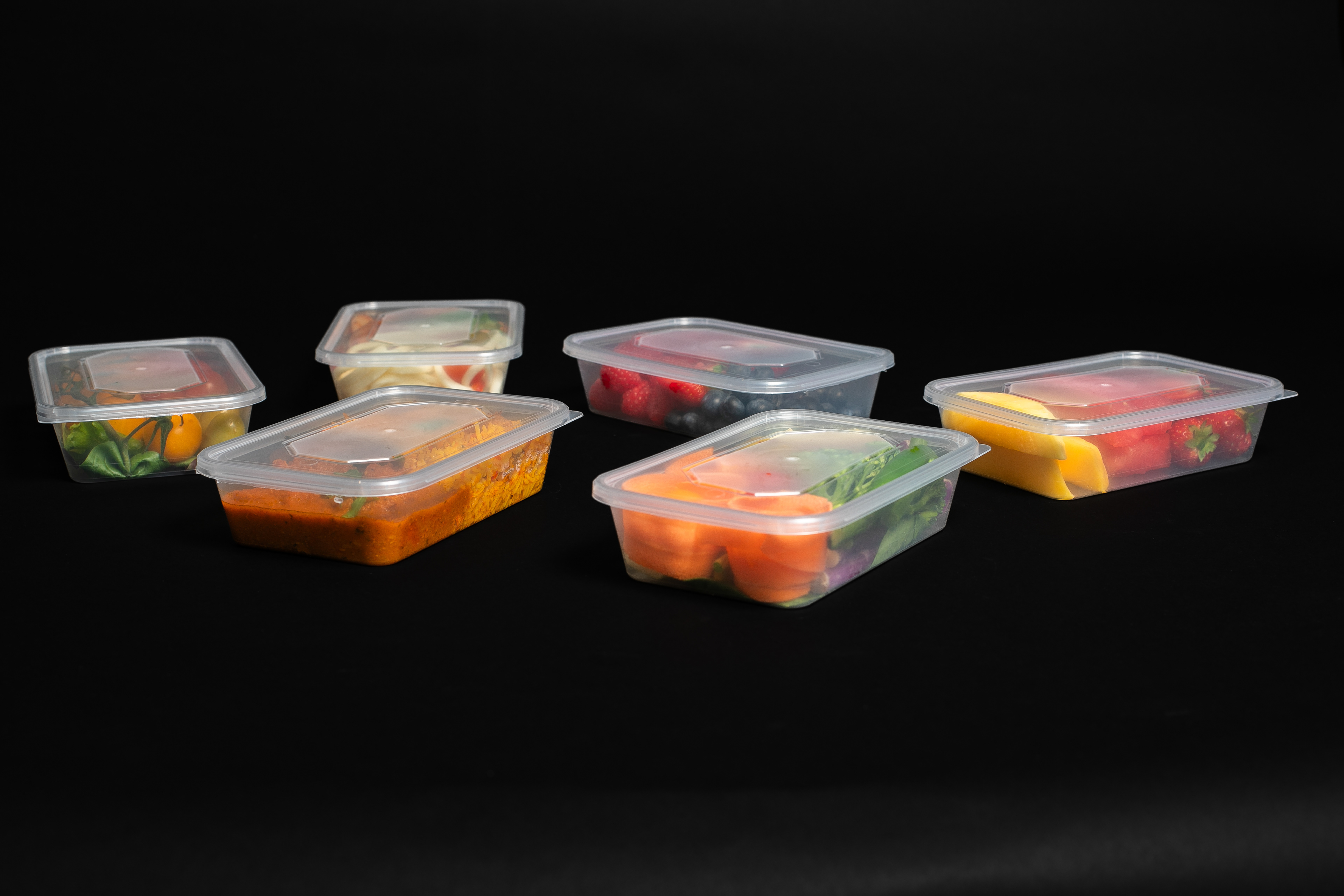
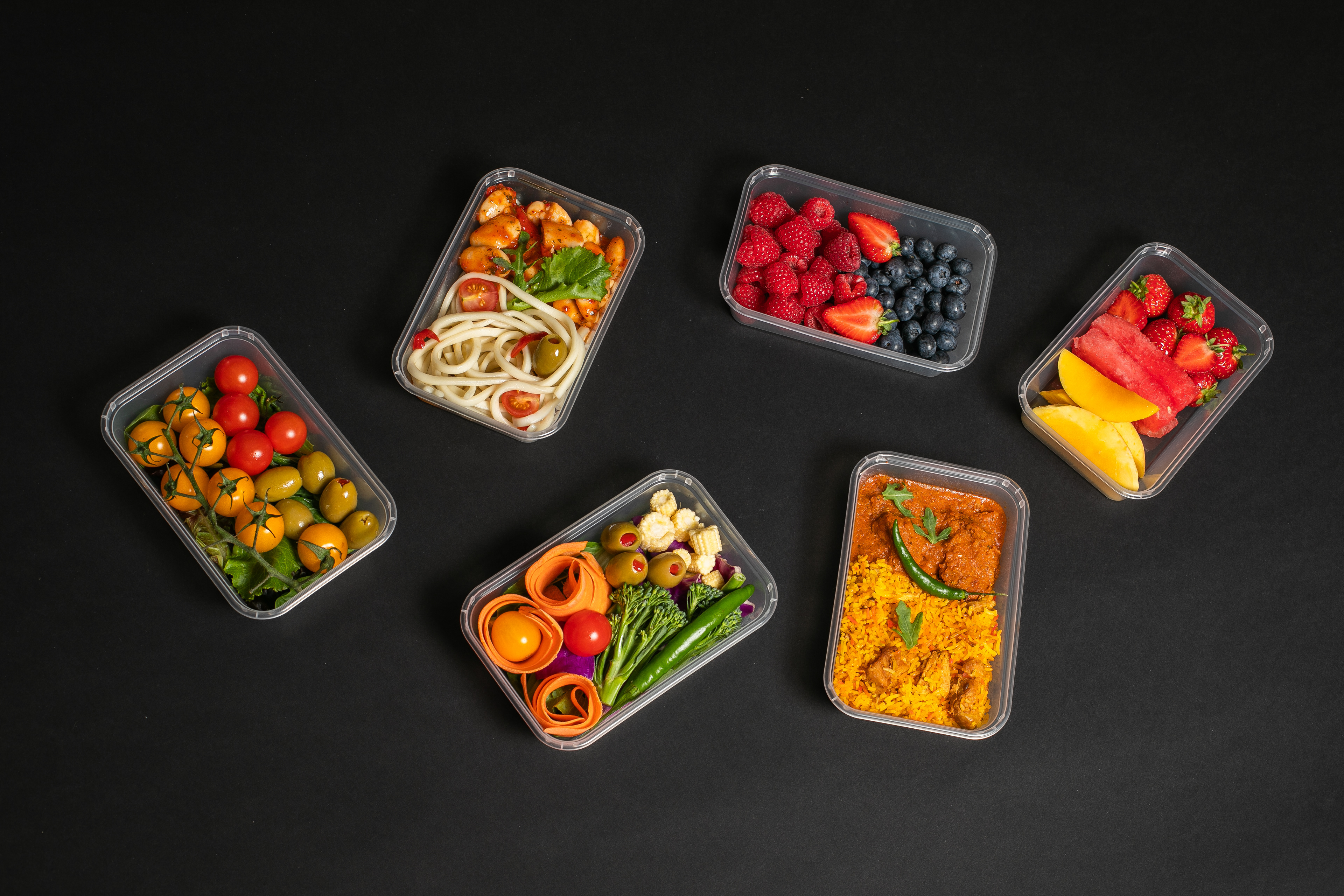
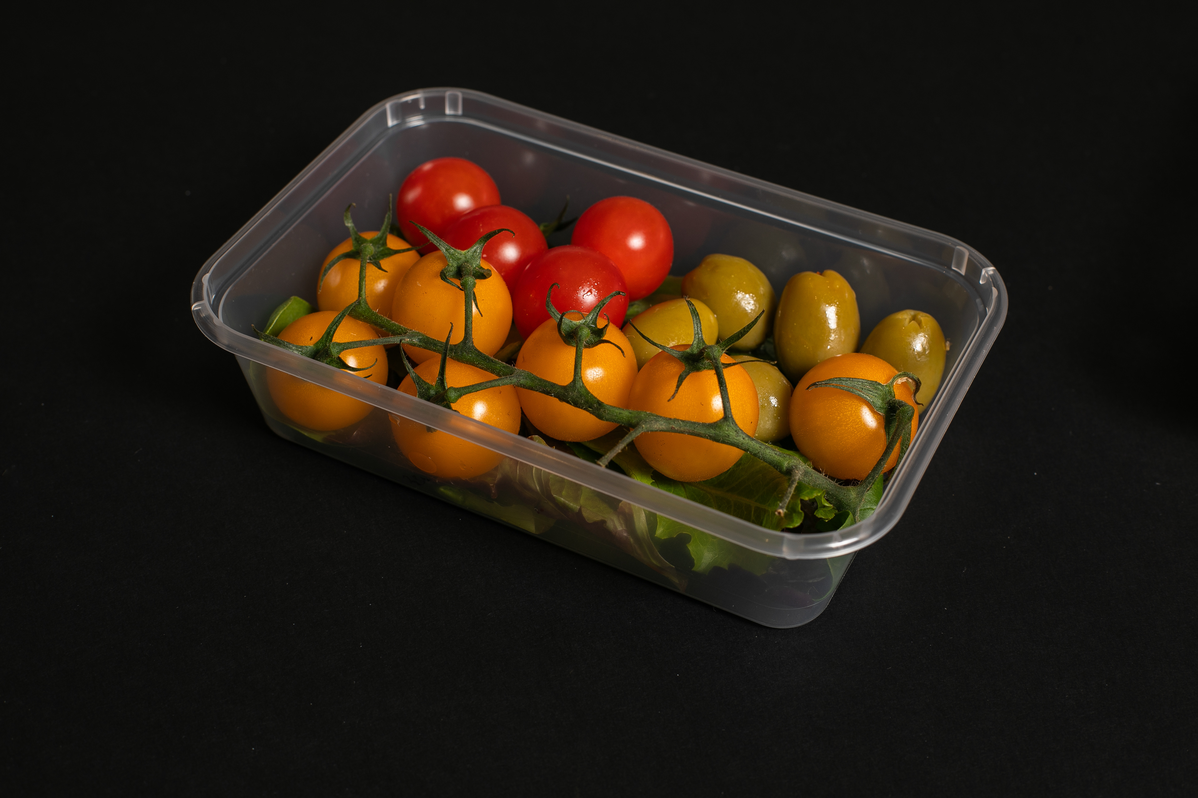


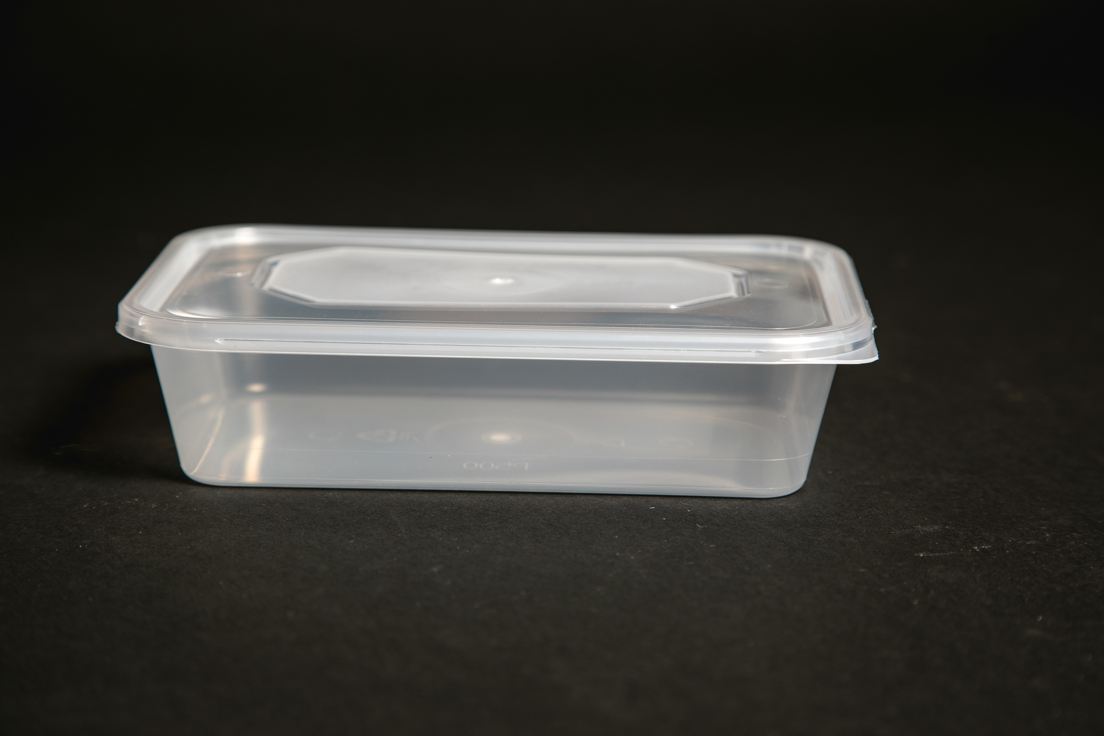


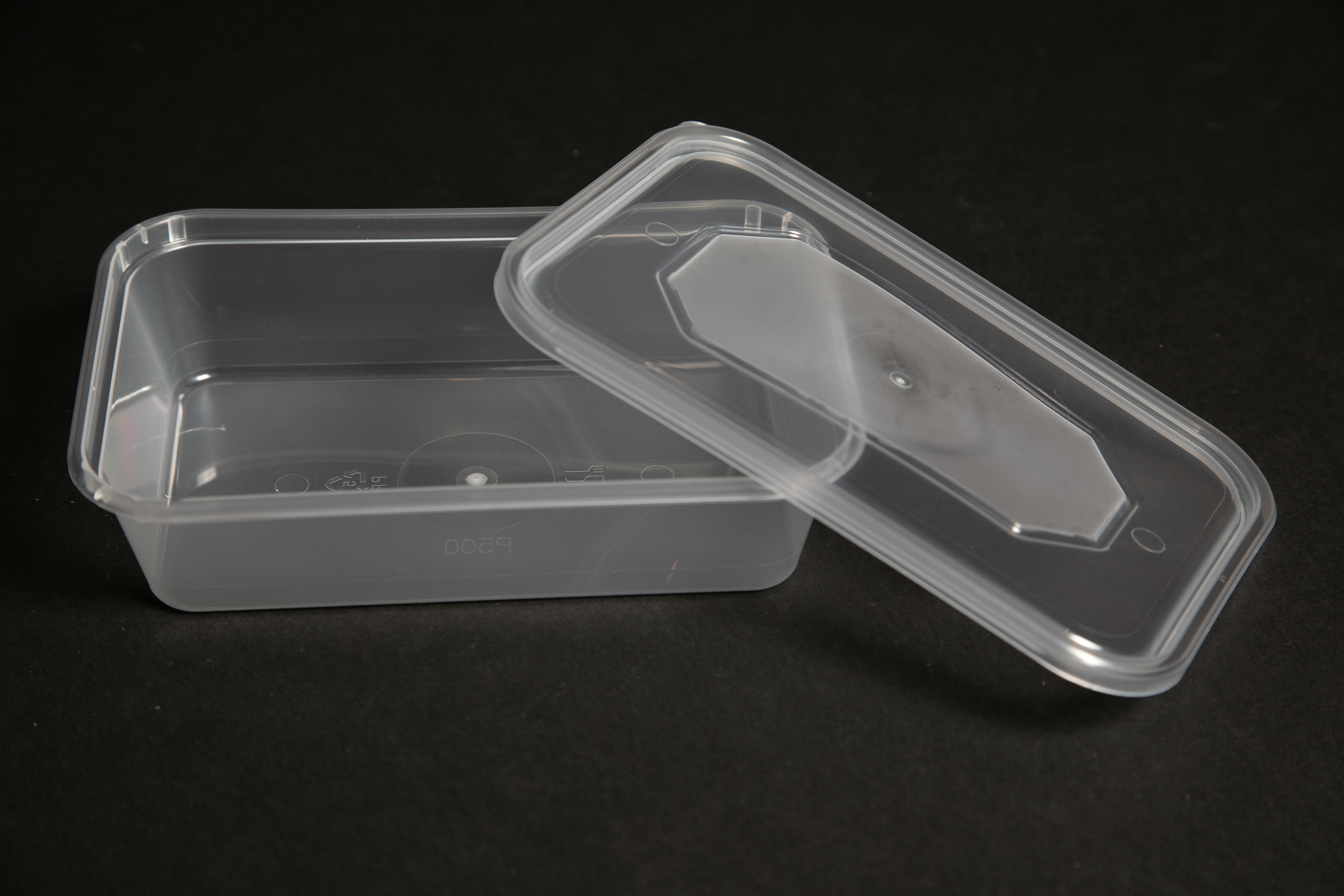
I focused on refining my photography skills by carefully composing the containers, similar to how most food packaging emphasises the product. My goal was to showcase the quality of the containers and their contents. I also included a variety of foods to inspire customers with ideas on how they can use the containers for different types of meals before buying these products.
The packaging designs for "East in West" microwave plastic food containers effectively convey product quality and brand identity through sophisticated colour schemes and organised layouts. The 500 ml containers feature a black background with gold accents, signifying luxury and high quality, while the 650 ml containers use black and red accents to signify energy and passion. The black background provides a sense of elegance and professionalism, often associated with premium products.
Each design clearly displays product information, including capacity and quantity, alongside vibrant images of the containers filled with fresh food, emphasising usability. The "East in West" logo, featuring the UK map, dragons, and pagoda outline, reinforces the cultural blend. Key product features such as "BPA Free," "Heavy Duty," "Snap on Lids," "Microwave Safe," "Freezer Safe," "Leak Resistant," "Non-Toxic," and "Reusable" are highlighted through icons, quickly communicating benefits to customers.
The inclusion of a friendly chef image adds a human touch and suggests culinary expertise, enhancing trust and appeal. The phrase “Premium Products” further reinforces the high-quality positioning. The use of gradients in the background adds depth and dimension, making the packaging visually appealing and ensuring that text and icons stand out.
The image you uploaded is a 3D rendering of "East in West" microwave plastic food containers with lids. It showcases two different packaging options: one for 500ml containers and one for 650ml containers.
The image you uploaded is a 3D rendering of "East in West" microwave plastic food containers with lids. It showcases two different packaging options: one for 500ml containers and one for 650ml containers.
I've designed a Facebook cover post, website banners and other medias to promote these products, ensuring that visitors to the Adams Cash and Carry Facebook page and website will see them immediately. The campaign message is "BUY 3 GET ONE FREE," which provides an incentive for customers to make a purchase.
I've designed a TV banner for the store, so whenever customers enter the cash and carry, they'll see this offer displayed on the screen.
I've made a short TikTok video to showcase the key features of these new food container products and explain why they're a must-have. At the end, I included the same promotion: BUY 3, GET 1 FREE.
